Pages

Tuesday, March 25, 2014

Lovely Ombre Backgrounds

Super Easy Ombre Technique!

It's Ombre day over at Practical Scrappers and I created this layout to showcase the technique I used for the background.
The background is made up of 3 layered pieces of white metallic card stock.  I rubbed an ink pad on the card stock to create the ombre look. More ink at the top, and less at the bottom created the desired look. 

After I created the background I added some fun dimensional touches.  

And a title on this wooden banner!  

p.s. Simple technique=Simple yet beautiful layout!


Thursday, March 20, 2014

Scrapping Our Stash Blog Hop!!

We are having another super fun 
SCRAP OUR STASH BOG HOP!

You should have arrived here from the great project shared by Heather Sweet. If not, go back and check it out, or go back to the very beginning of our hop at Practical Scrappers

Today I have quite a few SUPER simple cards to share with you that used only my stash! You see, we have had a cold winter for us North Carolinian's and the first beautiful day we had, I took my scrap paper bin and a couple of essentials outside and I spent a couple of hours putting together some pretty cute cards!

Here was my little work area and the only things I had to work with. 
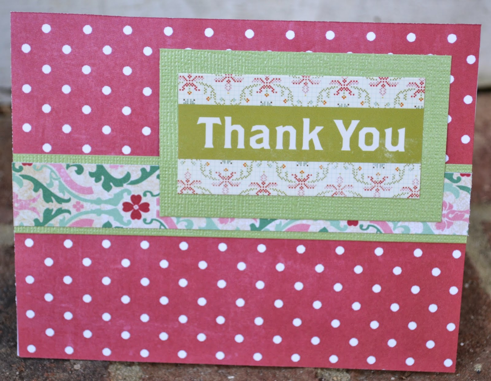
 Here are all of the the cards I created! 
And a close up of each one:


Not too shabby right!?!  Its was a lot of fun to limit my supplies and be able to create these fun, cute and simple cards!  Nothing fancy but still super cute and made with some of my favorite papers from the past!!

After you follow me here, hop along to Majken Pullin who has another great project idea for you!

p.s. have fun hopping! Don't forget to hop back here to see what fun new project ideas I have to share! 

Monday, March 17, 2014

On Cloud 9!

I often scrapbook about my kiddos and not very often about my hubby and I.
 Today I am sharing a layout I created about my Dear Husband and I.  


 This flower was one of my daughter's broken hair clips!
He holds the key to my heart!  

A little bit of paint around the edges and what layout is complete without some sparkle! And I love these colorful burlap sheets!  


Cloud 9 is a Great place to be!  


p.s. scrap abpout something new!

Tuesday, February 25, 2014

On Trend topic: Gold!


Over at Practical Scrappers today we were challenged to use gold in a project.  This seems easy enough, but I am not a big fan of gold so I thought I would challenge myself.  I am glad I did because I love this layout! I hope you do too!


I took a wooden frame ornament, cut off the string and painted it metallic gold.  


I used a gold gel pen to add some doodling detail and a bit of journaling.  
p.s.Challenge yourself to use a color outside your comfort zone, you might be surprised by the results!


Monday, February 24, 2014

Family Monogram with the Cameo

There are not nearly enough hours in the day to do all of the creative and crafty things that I have in my brain, but this is one thing I wanted to create from the moment I got my Silhouette. We moved into a new house, Our Forever Home, over the summer and I have been doing little things to make it our own.  I finally had the time to sit down and get this out of my head, onto vinyl, and onto my wall.  

I have yet to have the time to figure out how to create my own designs on the Silhouette, and since I did not want to wait any longer I took shapes I purchased from the Silhouette Online Store, and 2 fonts, combined them, and created a gorgeous monogram for our wall.   

I began with the Daniela Angelova Doilies and the Echo Park Flourish.  I chose the doily I wanted to use, and deleted the others.  I placed it in the middle of the work area. Then I took the flourish and placed it on the left side of the doily and played with the size until I got the proportion I wanted.  Then I copied and pasted the flourish, flipped it horizontally and placed it on the other side of the doily.  I then made sure the flourishes joined the doily at the same place and clicked the weld button to join them into one shape.

Next, I played with fonts until I found the ones I liked best.  I used Antiqua for the S and the Established 2001.  I used Edwardian Script for The Selah Family. (DOn't forget to weld your letters, too!) I laid it all out exactly as I wanted it to cut to be sure I liked the proportions and layout. I played with the size and proportions ALOT until I got it exactly how I wanted it. 

I cut the background on one piece of black vinyl, the name and date on another and the initial on cream, as close to the wall color as I could find.  This was my first attempt at such a large and complicated design. It is approx. 18" X 24".  It is not perfect but I still have a lot to learn! If you have any questions, feel free to ask! 

p.s. follow my blog! You never know what fun stuff might be coming...

Thursday, February 20, 2014

A layout for No Reason!

Woo Hoo! This weekend I actually created 2 layouts for no reason! I have been so busy with minimal time for scrappin'.  It is always the first thing to go off the to do list when there are other things to do! This has been extra hard because I was able to shop the Archiver's Going out of Business sale :(  and had TONS of new goodies to work (PLAY) with!  
I started with the base paper placed a piece of peach chevron behind the word love.  Once I did this it was like a light went off and I HAD to use navy for the focal color.   
I went with this navy and white polka dot paper.  If you have been following me for a while, you know I do not often place pictures on my layouts crooked.  I placed this photo straight and at some point bumped it and caused the picture to slant.  I was amazed at the difference it made and that I LOVED IT!  
Added some cute flowers around the layout and some chippies. 
This is my favorite type of bow to include on a layout and they are so simple.  I learned it when I first got my Silhouette and cut a paper bow.  It is just 3 pieces of burlap and lace ribbon instead of paper and I use glue dots to hold it together.  (Maybe a simple bow making tutorial to be coming soon!) 
Some final little details to bring it all together!
p.s. Make time to create a layout for no reason!    

Friday, February 14, 2014

Scrap Your Stash Blog Hop!

HAPPY VALENTINE'S DAY!

We are having a Blog Hop over at Practical Scrappers using up our stash to make Valentine's Day and Love projects! You should have arrived here from Kim Ryden, if not run back here and start from the beginning! 

I have 2 projects that I am very excited to share with you! 
The first project I created using specialty papers and embellishments that I have had in my stash and I just could not bring them together in a way I liked until now.  The hearts on the background paper are flocked and I thought a little would go a long way but I finally decided to use the whole sheet and go big or go home as the saying goes. 
"Together is Best"
Used a glitter sticker and added some scrap paper flags.
I stamped the circle then placed a heart on top.  I cut the heart from the paper behind the picture...an easy way to incorporate part of the paper without buying 2 sheets!  
Added some fun fabric embellishments along side the picture.  I just love how the blue sets off the red!  

My second project is a home decor piece that was inspired by this project on Pinterest.
I  *might* need this... Beautiful! The Giving Tree (8 x 10) Cut Paper Art. $30.00, via Etsy.
I saw this and thought what a great way to use up some of the scrap pieces I have in my stash! 
I used my silhouette and my daughter's arm!  
I love how it turned out!  
Thanks for stopping by and I would love to have you as a follower!  
Be sure to follow this link to the next designer, Charity Hotrum, on this amazing Hop! 

p.s.I hope these projects inspire you to take a look at your stash and use it!